How to Choose a Foil Color for Stamping: Metallic vs Pigment vs Holographic (With All 162 Codes)
A stationer's guide to picking a hot-stamp foil: how metallic, matte pigment, gloss pigment and holographic foils behave on white, dark and kraft paper, how to read a foil code, which Colorplan papers pair with each family, and the artwork rules that keep fine type crisp.
Quick answer
If you want the piece to read as 'foil' from across the room, choose a metallic (standard gold 120, standard silver 110, standard copper 142 or a rose gold). If you need a solid white, black or brand colour on dark or kraft paper, choose a pigment foil — matte for a flat, modern look, gloss for a wet-look accent. If the piece has to catch the light at an event or on a shelf, choose a holographic. Whatever you pick, write the exact code from our chart on the order — letters included — because every code is a different roll of foil and every foil colour needs its own stamping die.
What a foil code actually tells you
Hot-stamp foil is a thin layer of pigment or metal on a polyester carrier. Heat and pressure from a brass or magnesium die transfer it onto the paper. The code on our chart identifies the exact roll: plain numbers (120, 110, 311, 409) are the core range — 120 is our standard gold, 110 our standard silver and 142 our standard copper; a letter prefix marks a variant — MR and MK are metallic variants, HK, HU and HT are holographic patterns, PW is a translucent pearl white, CG a clear gloss, and 'Scratch off 113' or '131' are the opaque scratch-off foils used for promotions and gift cards. HU941 and 941 are not the same foil, so always quote the whole string.





The five foil families
| Family | Look | Best on | Watch out for |
|---|---|---|---|
| Metallized (72 foils) | Mirror-bright golds, silvers, coppers, tinted metallics | Smooth and silk cover, Colorplan, black and dark stock | Large solids can pinhole on heavily textured felt or linen |
| Matte pigments (28) | Opaque flat colour, no shine | Kraft, chipboard, Colorplan, uncoated — anywhere ink would sink in | Scuffs on high-traffic packaging |
| Gloss pigments (28) | Opaque colour with a wet-look gloss | Smooth cover, dark and black paper, rigid boxes | Gloss highlights halftone edges — vector art only |
| Holographic (18) | Full-spectrum rainbow and oil-slick shifts | Coated and silk stock, black for contrast | Type under 8 pt disappears into the pattern |
| Holographic & specialty (16) | Patterned holographics, pearl, clear, scratch-off | Dark or coloured stock for pearl and clear | Translucent foils pick up the paper colour underneath |
Every family is a tab on the chart, and every swatch is photographed on white stock with the Kolt K knocked out of the foil so you can judge edge sharpness, not just colour.
Metallic: when you want it to look like foil
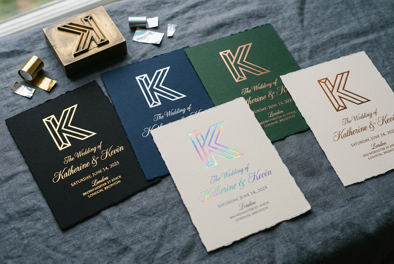
Metallics are what most people picture — the gold monogram on a wedding invitation, the silver crest on a presentation folder. Our standard metallics (120 gold, 110 silver, 142 copper) have a true mirror finish that reflects the room; tinted metallics (rose gold, copper, champagne, gunmetal) are slightly softer and read as more 'designed'. On white or cream paper any metallic works. On dark paper, bright gold and silver give the highest contrast; rose gold and copper are warmer and sit beautifully on navy, forest and claret.
- Gold 120 on Colorplan Ebony or Imperial Blue — the default luxury wedding suite.
- Silver 110 on Dark Grey or Bright White — corporate certificates, award folders, modern invitations.
- Copper 142 or rose gold on Natural, Mist or Racing Green — warm, editorial, photographs well.
- Avoid light metallics (champagne, pale gold) on cream and natural stock — contrast is too low to read at a distance.
Pigment: when ink cannot do the job
Offset and digital ink is translucent — print white or a pale brand colour on kraft or black paper and it vanishes. Pigment foil is opaque, so a white pigment on kraft stays crisp white and a brand red on black is red, not maroon. Matte pigments (311–390) give a flat, contemporary finish that hides fingerprints; gloss pigments (409–490) add a lacquered highlight that works on rigid boxes and dark packaging. Pigments are also the right choice when the brand guide forbids metallic effects.




Holographic: when it has to catch the light
Holographic foils diffract light into a rainbow (910, 920) or into a pattern — glitter, shattered glass, pillars of light (the HK, HU and HT codes). They are built for event badges, product packaging, concert tickets and anything that lives under spotlights. Two rules: keep the stamped shapes bold, because fine type breaks up in the pattern; and stamp on black or very dark stock when you want the effect to be the whole story, or on white when the rainbow should stay subtle.
Pairing a foil with Colorplan paper
Foil is opaque, so the question is contrast and temperature rather than 'will it show'. Select any foil on the chart and the spotlight panel shows four stationer's picks from the GF Smith Colorplan range plus the two highest-contrast shades for that exact foil, each rendered as the K on that paper. The combinations we specify most often:
| Foil | Paper | Why it works |
|---|---|---|
| Gold 120 | Colorplan Ebony | Highest-contrast luxury pairing; the standard black-tie suite |
| Gold 120 | Imperial Blue / Racing Green | Warm metal on a cool deep colour — reads expensive, photographs well |
| Silver 110 | Dark Grey / Bright White | Clean, corporate, modern |
| Copper 142 | Natural / Mist / Racing Green | Warm standard metallic; soft, editorial, low-glare for daytime weddings |
| White matte pigment | Kraft / Nubuck Brown | The only way to get crisp white on kraft |
| Rainbow holographic 910 | Ebony | Maximum shift; the paper disappears and the foil does the talking |
Artwork rules that keep the stamp sharp
- Vector only — PDF, AI or EPS. A raster logo gives a soft-edged die and a soft stamp.
- Minimum 0.5 pt line weight and 6 pt sans-serif type (8 pt for serifs and all holographic foils).
- Knock-out (reversed) type at least 1 pt — thin counters fill in with foil.
- One layer or one spot colour per foil. Two foil colours means two dies and two press passes.
- Keep foil 0.125" away from folds and scores; a stamp across a crease cracks.
- On textured stock (felt, linen) keep solids under about 1 square inch or expect some pinholing — or move to a smoother sheet.
How to order it
On our hot-foil products — Foil Stamp Wedding Invitations, Foil Wedding Envelopes and the foil option on Soft Touch Invitations — there is a 'Foil color' step in the configurator. Pick the code there and it prints on your order, invoice and the press job sheet. Prefer to leave it to us? Choose 'Kolt recommends' and our prepress team will propose a foil to match your artwork and paper at proof stage. For folders, letterheads, postcards and packaging, send the code with a quote request.
- Foil Stamp Wedding InvitationsHot foil on 16pt or 100lb linen · pick your code in the configurator
- Foil Wedding EnvelopesReturn address, monogram or crest on the flap
- Soft Touch Wedding InvitationsVelvet lamination with an optional hot-foil accent
- Foil + Embossed Luxury Pocket FoldersRegistered foil and emboss on presentation folders
- Foil Stamped LetterheadsMetallic marks on corporate stationery
- Hot Foil PostcardsFoil accents on 16pt postcards
- How do I choose a foil color for stamping?
- Start with the job of the foil: metallic when the piece should visibly read as foil (gold, silver, rose gold, copper), pigment when you need an opaque white, black or brand colour on dark or kraft paper, holographic when it has to catch the light. Then check contrast against your paper — bright gold or silver on black and navy, rose gold or copper on natural and grey, white pigment on kraft — and quote the exact code from the chart.
- What is the difference between metallic and pigment foil?
- Metallic foils have a reflective, mirror-like finish in gold, silver and tinted metallics. Pigment foils are opaque flat colours with either a matte or a gloss surface and no metallic shine; they exist to put a solid colour where printing ink would be translucent or sink in.
- Can I foil stamp white on kraft paper?
- Yes — with a white matte or gloss pigment foil. Printing ink cannot produce an opaque white on kraft, but pigment foil is fully opaque and stamps crisp white.
- Does gold foil look good on black paper?
- Gold 120 — our standard gold — on black Colorplan Ebony is the highest-contrast classic pairing for wedding suites, certificates and luxury packaging. Rose gold and copper are warmer alternatives that also sit well on navy, forest green and claret.
- Why do foil codes have letters like HU or MR?
- The letters identify a variant roll from the foil maker: MR and MK are metallic variants, HK, HU and HT are holographic patterns, PW is a translucent pearl white and CG a clear gloss. HU941 and 941 are different foils, so always write the complete code.
- How many foil colours can one piece have?
- As many as you like, but each foil colour needs its own stamping die and its own press pass, so every extra colour adds die cost and time. Most pieces use one foil, premium suites two.
- What artwork do I need for foil stamping?
- Vector artwork with the foil elements on their own layer or spot colour, minimum 0.5 pt lines and 6 pt type, knock-outs at least 1 pt, and foil kept 0.125 inch away from folds. Our prepress team checks every file before a die is cut.
- Will the foil match the swatch on my screen?
- Not exactly. The chart swatches are photographs of real foil on white stock, and screens, viewing angle and the paper colour underneath all shift metallic and holographic foils. For a critical brand match, request a stamped sample on your chosen stock.
Kolt Printing ships from Houston, TX every business day.
Live pricing on every product. Free die templates. Same-day shipping cut-off at 11 AM Central. Trade pricing for agencies and print brokers.