White Ink on Dark Paper: How to Set Up Vector Files for Our OKI White-Toner Press
How white ink printing on dark Colorplan paper works on the OKI white-toner press, exactly how to build the vector file (spot colour, outlines, minimum line weights), and design examples on Ebony, Imperial Blue, Racing Green and Claret.
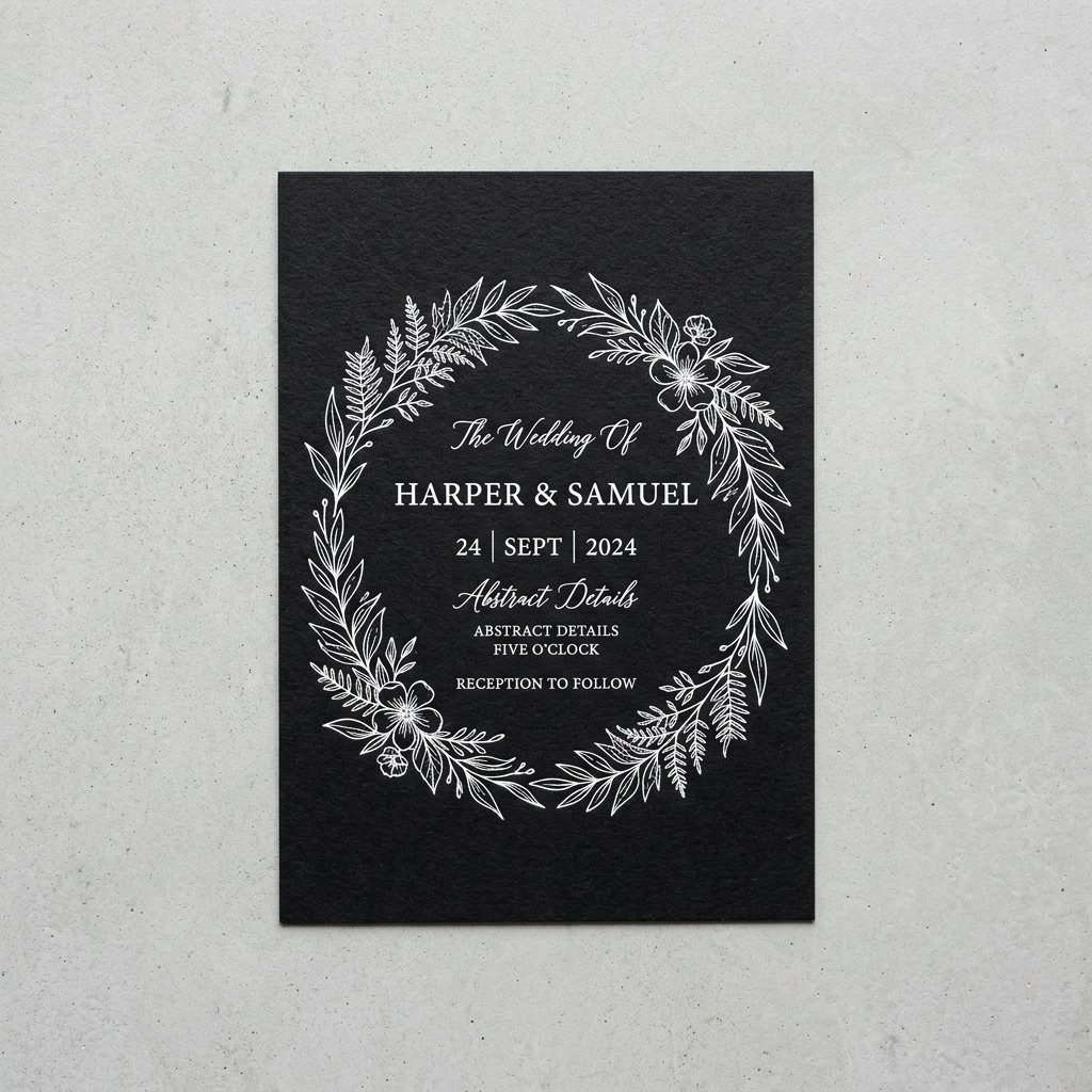
Dark paper does something ordinary CMYK printing can't: it makes white the ink. On a normal press there is no white — the paper is the white, and every colour is a filter over it. Put black, navy or claret Colorplan through that press and your type simply disappears. Our OKI white-toner press fixes that by laying down a genuinely opaque white toner, so crisp white script, hairlines and logos sit on top of the darkest uncoated stocks with no grey show-through.
How the OKI white-toner press works
The OKI Pro-series white-toner engine runs a dedicated white toner cartridge in place of (or alongside) the CMYK set. Toner is fused to the sheet with heat rather than absorbed like liquid ink, which is exactly why it stays bright on dark, uncoated, textured paper — the white sits on the surface instead of sinking into coloured fibres and going muddy. It prints sheet-fed on stocks up to 350 gsm, which covers every Colorplan weight we stock for invitations, menus and business cards.
- Opaque white in a single pass on most designs; heavy solid areas get a second hit for maximum density.
- Dry toner — no drying time, so foil, scoring, folding and mounting can follow the same day.
- Toner is bonded to the surface: it's scuff-resistant and will not crack on a score line when set up correctly.
- Runs from 25 pieces up. No plates, no minimums, a printed proof on the actual stock is available.
Design examples on dark Colorplan
The file we need: vector, one spot colour
White toner is a spot colour, not a CMYK mix. The press needs to know precisely which shapes get white and which stay bare paper, and it needs edges it can render cleanly at 1200 dpi. That means a vector PDF built in Illustrator, InDesign or Affinity — not a Canva PNG, not a JPEG mock-up of white type on a black rectangle.
| Requirement | What to do | Why it matters |
|---|---|---|
| File type | Vector PDF (PDF/X-4). Illustrator .ai or InDesign packages also accepted. | Raster white type gets anti-aliased grey edges that print as speckle. |
| Spot colour | Create ONE swatch named exactly “White”, type Spot, any preview colour (we use 100% cyan so it's visible on screen). Fill every white element with it. | The RIP maps the “White” separation to the white toner unit. |
| Paper as background | Do NOT draw a black/navy rectangle for the paper. Leave the artboard empty — the Colorplan is the background. | A solid CMYK flood would otherwise print black toner over black paper and waste a pass. |
| Overprint | Set the White swatch to Overprint Fill/Stroke (Attributes panel). | Prevents the RIP from knocking out anything beneath and keeps registration simple. |
| Fonts | Outline all type (Create Outlines) or embed fonts fully. | No font substitution surprises on the press. |
| Minimum line weight | 0.5 pt positive lines; 0.75 pt if the line is long and isolated. | Below that, toner coverage breaks up on textured stock. |
| Minimum type size | 6 pt for sans-serif, 7 pt for serif or script with thin strokes. | Hairline serifs vanish under 7 pt on 350 gsm tooth. |
| Tints & gradients | Use 100% White only. Avoid tints under 40% and avoid gradients to zero. | Halftoned white reads as grey dust on dark paper. |
| Solids | Large solid areas are fine — flag them in the order notes so we schedule a second hit. | Guarantees full opacity on the darkest stocks like Ebony. |
| Bleed & safe area | 0.125" bleed only if art touches the edge; keep type 0.1875" inside trim. | Standard trim tolerance on heavy stock. |
| Reverse elements | If you want dark type inside a white panel, keep the knockout type ≥ 7 pt and strokes ≥ 0.75 pt. | Toner spread closes up fine reversed detail. |
Quick Illustrator recipe
- New document at final trim size; delete any background rectangle.
- Swatches ▸ New Swatch ▸ Name: White · Color Type: Spot · set the preview to 100% C.
- Select all white artwork ▸ fill/stroke with the White swatch ▸ Window ▸ Attributes ▸ tick Overprint Fill (and Stroke).
- Type ▸ Create Outlines. Object ▸ Expand any brushes or effects.
- Window ▸ Separations Preview: you should see exactly one plate named White and nothing on C, M, Y or K.
- File ▸ Save As PDF ▸ preset PDF/X-4:2010 ▸ Marks & Bleeds: 0.125" if needed. Upload with your order.
Adding a second colour (white + foil, white + CMYK)
White pairs beautifully with a metallic foil pass — gold names in foil, details in white toner. Build the foil elements on a second spot swatch named “Foil” using the same rules. If you need a full-colour photo or illustration on dark stock, we print a white underbase first and CMYK on top; build the underbase as the White spot on its own layer, slightly choked (0.15 pt) inside the colour art, or simply ask us to generate it from your artwork.
Dark Colorplan stocks that love white ink
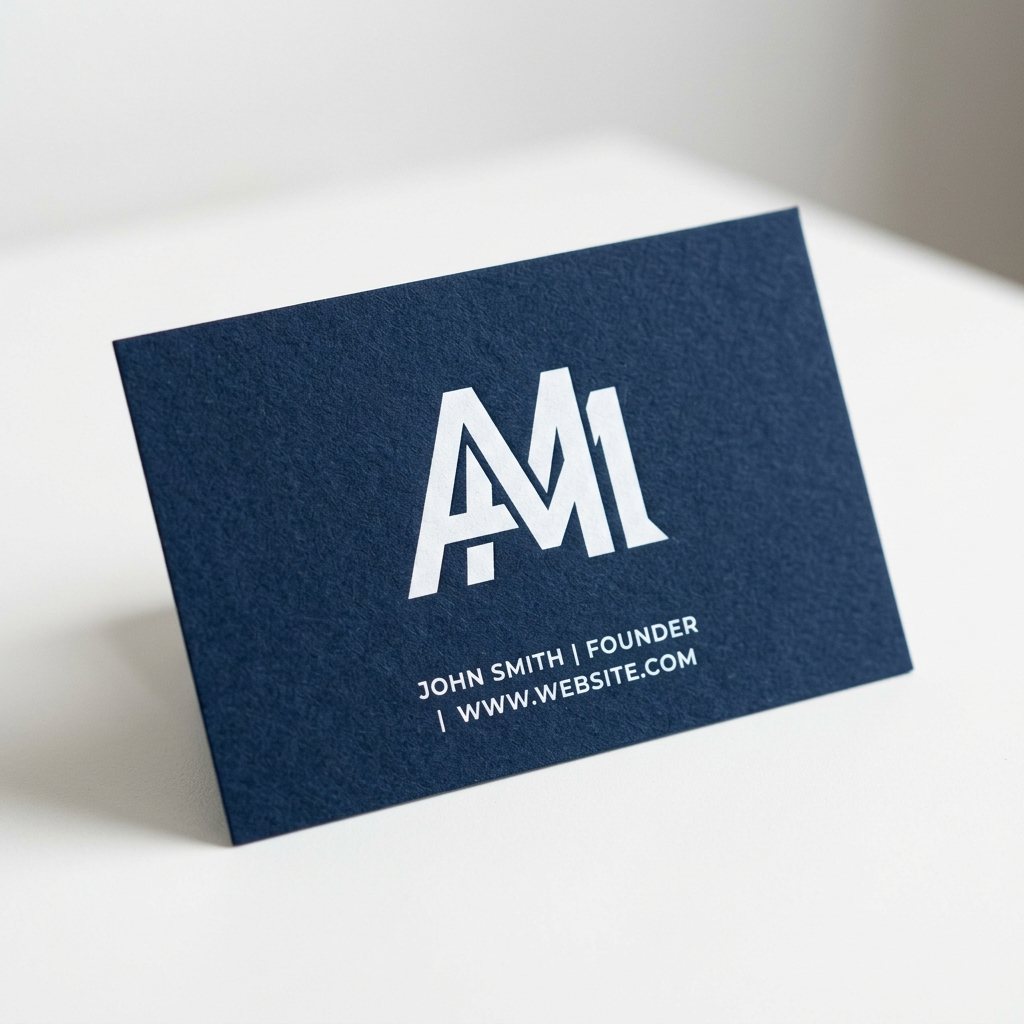
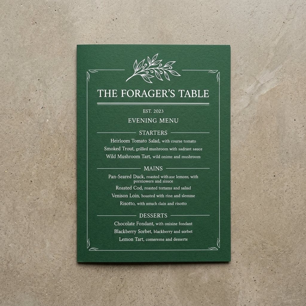
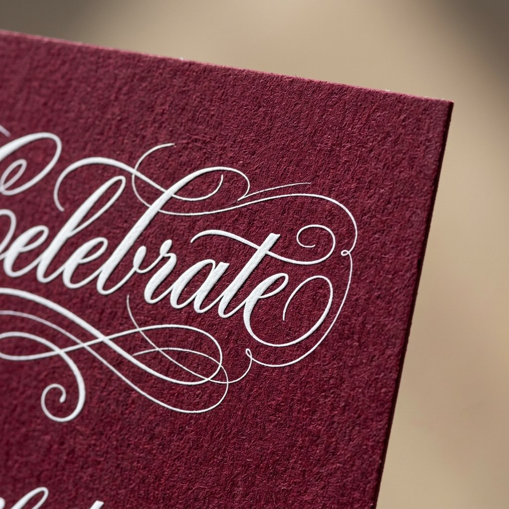
All of these are uncoated, 100% ECF wood-free with the same soft tooth. The darker and cooler the sheet, the more the white pops. Ebony and Imperial Blue are our two best-sellers for white-ink invitations; Racing Green and Claret dominate menus, holiday cards and hospitality.
- Ebony — pure black, the highest contrast available.
- Imperial Blue — deep navy, classic for weddings and law-firm stationery.
- Racing Green — dark forest green, superb for restaurants and holiday.
- Claret — deep burgundy, warm and formal.
- Dark Grey, Cobalt, Emerald, Forest, Amethyst — also stocked on request.
55 shades shown as approximate screen values. Uncoated paper reads differently under daylight and tungsten — order theofficial GF Smith swatch book or ask us to send a physical sample with your quote.
What white ink is not good at
- Photographs in white only — a single-colour halftone photo prints as grey grain. Use a white underbase + CMYK instead.
- Sub-0.5 pt hairlines and sub-6 pt type — they break up on textured stock.
- Coated or laminated dark stocks — toner adhesion is best on uncoated Colorplan; ask before mixing.
Ordering & proofs
Upload your PDF with the order, choose the Colorplan colour and weight, and we'll send a digital proof with the White separation shown as a preview colour so you can confirm exactly what prints. A physical printed proof on the real stock is available for any white-ink job — for dark stocks we recommend it the first time you run a new design.
- White Ink Wedding Invitations
- White Ink · Midnight Black Business Cards
- Wedding Invitations & Stationery
- Can I send a PNG of white type on a black background?
- We can trace simple logos and type from a high-resolution file, but the result is never as clean as vector and it adds a day. A native vector PDF with a “White” spot swatch is always best.
- Does white ink crack when the card is folded?
- Not when the piece is scored before folding, which we do on every folded item over 270 gsm. Avoid placing large solid white areas directly on the fold line.
- Is white toner truly opaque on black?
- Yes on a single pass for line-art and type. For large solids on Ebony we run a second hit to reach maximum density — flag solids in your order notes.
- How white is the white?
- It's a bright neutral white, slightly cooler than the paper white of Colorplan Pristine White. On navy and green stocks it reads brilliant; on Ebony it has the highest contrast of anything we print.
- What's the minimum quantity?
- 25 pieces. There are no plates, so short runs and a single printed proof are practical.
Kolt Printing ships from Houston, TX every business day.
Live pricing on every product. Free die templates. Same-day shipping cut-off at 11 AM Central. Trade pricing for agencies and print brokers.