Letterpress Printing Done Right — One Pantone Colour, Deep Impression, Duplexed Colorplan
How to get the best out of letterpress: why one colour (ideally a Pantone spot) gives the crispest, most matchable result, why duplexed GF Smith Colorplan is the ideal stock for a deep impression, artwork rules for type and line weights, and how to request a custom quote.
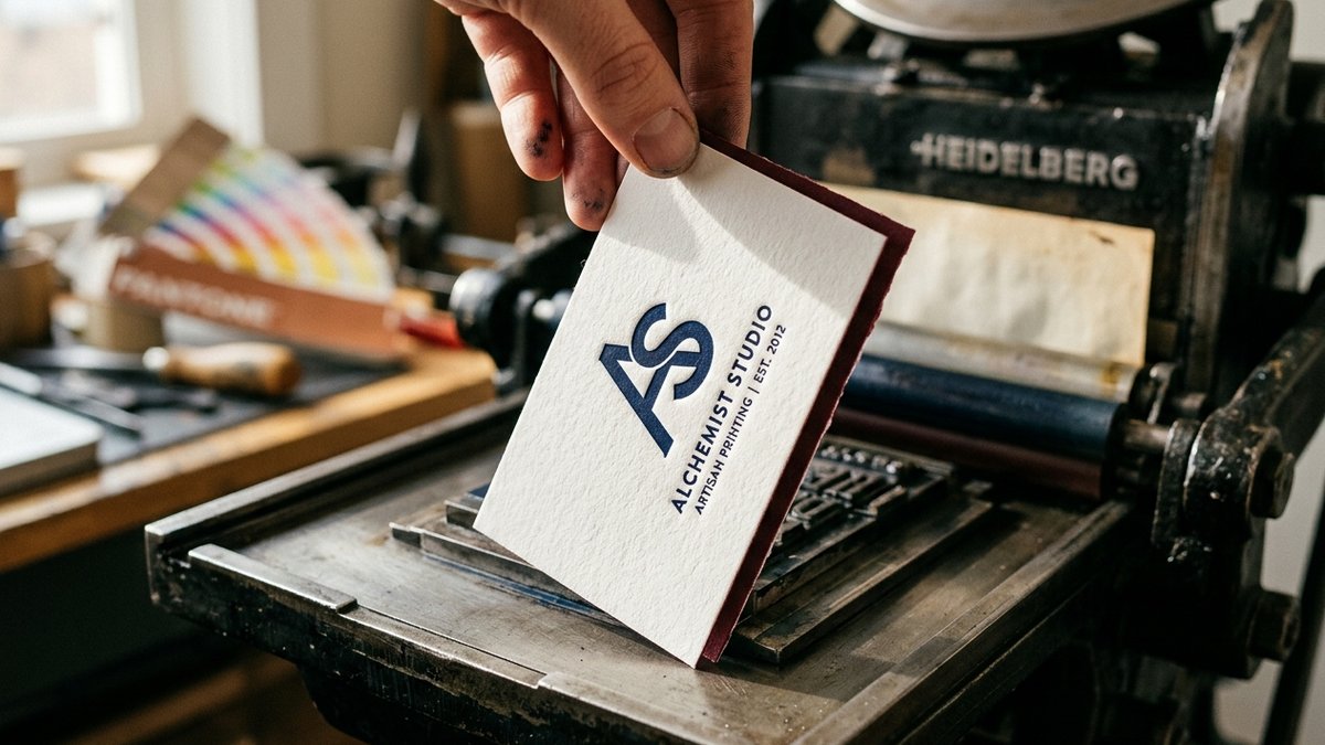
What letterpress actually is — and why it feels different
Letterpress is relief printing: a raised photopolymer plate carrying your design is inked, then pressed into the paper under real pressure. Nothing is sprayed or fused onto the surface — the image is physically pushed into the sheet, so you feel the design before you read it. That tactile bite is the whole point. It is the finish luxury brands, law firms, architects and couples choose when a business card or an invitation has to feel considered rather than printed. Kolt Printing runs letterpress in Houston, Texas, on Heidelberg platen presses, and ships nationwide.
Rule one: design for one colour
Letterpress is not a four-colour process. Every colour is a separate plate, a separate ink mix, a separate pass through the press, and a separate registration to hold. One colour is not a compromise — it is the format at its best. Here is why we recommend it on almost every job:
- Deepest impression. With one plate we can bite hard into the sheet without worrying about a second pass crushing or mis-registering against the first.
- Perfect colour match. We mix the ink by hand from the Pantone formula, proof it on your actual stock, and match it to the swatch under D50 light. Ask for the Pantone number you use everywhere else and your card will match your signage, your website, your packaging.
- Cleaner type. Small type and thin rules stay razor sharp because there is no second colour to trap or overlap.
- Better value. Every additional colour adds plate, make-ready and press time — typically 35–50% on top of a one-colour job.
If your brand really needs two colours, we can do it — but keep the second colour to a separate element (a logo mark, an edge rule) that does not touch the first, and expect a tolerance of about 1/64" on registration. Never ask letterpress to reproduce gradients, photographs or CMYK builds; that is a job for our offset or digital presses.
Why Pantone, not CMYK
- A Pantone spot colour is a single, physical ink — mixed to a published formula. It is the same in Houston as in Paris, which is why designers specify it.
- CMYK values are instructions for a four-colour press. Letterpress cannot build a colour from four screens, so a 'CMYK blue' has to be converted to the closest Pantone anyway — better you choose it than we guess.
- Uncoated stock shifts colour. Always specify the Pantone U (uncoated) reference; the same number in C (coated) will look brighter on screen than it will ever print on cotton or Colorplan.
- Dark, saturated inks bite best. Navy, black, deep burgundy, forest, charcoal and metallic bronze look richest with a deep impression. Very pale inks on a dark duplex read as blind (unprinted) impression — beautiful, but decide it on purpose.
- White ink is opaque but never truly bright on letterpress; for white on dark stock ask us about hot-foil instead, or design for a blind deboss.
Rule two: print it on duplexed Colorplan
Letterpress needs a soft, thick, uncoated sheet that will take an impression and hold it. Cotton does this well; GF Smith Colorplan does it beautifully — and in 55 colours. Colorplan is a mould-made, uncoated, dyed-through board with a chalky surface that compresses under the plate and keeps the relief for years. Duplexing bonds two 350 gsm or 540 gsm sheets back to back into one 700–1,080 gsm card, which gives you three things a single sheet cannot:
- Depth. A duplexed card is 1.0–1.4 mm thick, so the plate can bite deep on the front without the impression telegraphing through as a bump on the back.
- Two colours of paper for the price of one ink. Print one Pantone on a chalk-white face and let the back be Colorplan Imperial Blue, Bright Red, Forest or Ebony. The colour edge you see on the thickness of the card is the second colour — no second press pass.
- A two-sided card that stays clean. Print your details one-colour on the front and leave the coloured back blind — or print the back one-colour as well; with two separate sheets there is no show-through at all.
Our go-to letterpress combinations: Pristine White face with a Cool Blue, Ebony or Bright Red back; Natural face with a Forest or Racing Green back for a modern-heritage look; Mist or Pale Grey face with an Imperial Blue back for architects and law firms. Triplexing (three layers with a thin coloured core) is available for the ultimate statement card.
Artwork rules for a clean letterpress plate
- Vector only. Supply an Illustrator, InDesign or PDF file with all type converted to outlines and every element in one 100% Pantone spot colour swatch — no tints, no screens, no transparency.
- Minimum line weight 0.25 pt for positive lines; 0.5 pt for reversed (knocked-out) lines. Thinner than that and the polymer plate can break or the line fills with ink.
- Minimum type size about 6 pt for serif and sans faces; avoid ultra-light weights, which can vanish under impression. Bold weights hold ink and bite better.
- Keep large solid areas under roughly 1 square inch. Big solids look mottled ('salty') on letterpress because the uncoated fibre will not take a perfectly flat film of ink — break them up with texture or move them to foil.
- Leave 1/8" (3 mm) of clearance from trim on all sides; impression too near an edge can crack the card.
- Tell us how deep you want it. 'Kiss' (ink only, no visible impression), 'medium' (the classic) or 'deep' — we set the press to match.
Where letterpress pays off
- Business cards — 700 gsm duplexed Colorplan, one Pantone, deep impression. The card people keep.
- Wedding suites — invitation, RSVP and details card in one colour on a cotton or Colorplan duplex; add an edge paint in the second brand colour.
- Thank-you and correspondence cards, gift tags, coasters and menus for hotels and restaurants.
- Certificates, letterheads for signature use, and packaging inserts for luxury goods.
Pairing letterpress with other finishes
- Edge painting in a matching or contrasting Pantone shows on the thick duplexed edge — the most popular add-on.
- Blind deboss (no ink) of a logo on the coloured back, with one-colour letterpress text on the front.
- Hot-foil stamping for metallic gold, copper or silver accents, or for white on dark stock, where letterpress ink cannot go.
- Rounded corners and custom die-cut shapes cut cleanly through duplexed Colorplan.
Turnaround and how to order
Letterpress is a craft process: plates are made from your file, ink is hand-mixed to your Pantone, and every sheet is fed by hand. Standard turnaround is 7–10 business days after proof approval; rush production is possible on many jobs. Send us your artwork (or your Pantone number and a description if you want our designers to build it), the Colorplan colours you have in mind and the quantity, and you will have a written quote back within two business hours.
- GF Smith Colorplan Paper GuideAll 55 colours, weights, duplexing and finishes
- Foil-Stamped Invitations in HoustonWhen foil is the better choice than ink
- CMYK vs Pantone Spot ColourWhy spot colour matches and process colour drifts
Frequently asked questions
- Can letterpress print more than one colour?
- Yes, but each colour is a separate plate and press pass, adds cost, and must be registered to the first. One colour gives the deepest impression, the sharpest type and an exact Pantone match, which is why we recommend it for most jobs.
- Why do you ask for a Pantone number instead of CMYK values?
- Letterpress uses one physical ink mixed to a formula, not four process colours. A Pantone (ideally the U / uncoated reference) lets us mix and match the colour exactly; CMYK values have to be converted to a spot colour anyway.
- What paper is best for letterpress?
- A thick, soft, uncoated sheet. We recommend duplexed GF Smith Colorplan (two sheets bonded to 700–1,080 gsm): it takes a deep impression without show-through and gives you a second colour on the back and edge without a second ink.
- Can I see the Colorplan colours before ordering?
- Yes — all 55 shades are on our Resources page under Colorplan Paper Swatches, and we can post physical swatches on request.
- Can letterpress print photos or gradients?
- No. Letterpress reproduces solid line art and type only. Photographs, tints and gradients belong on our offset or digital presses, or can be combined with letterpress on the same piece.
- How long does a letterpress job take?
- Typically 7–10 business days after proof approval, printed in Houston, Texas and shipped nationwide. Ask about rush production if you have a deadline.
Kolt Printing ships from Houston, TX every business day.
Live pricing on every product. Free die templates. Same-day shipping cut-off at 11 AM Central. Trade pricing for agencies and print brokers.