Pantone Colour Matching Explained — Why 186 C and 186 U Are Not the Same Colour (and Which One to Send Us)
What a Pantone number really specifies, the difference between the C (coated) and U (uncoated) suffix, why the same ink looks different on gloss card and kraft, how to pick the right reference for your product, and how to preview it with our free Pantone ↔ CMYK ↔ HEX converter.
Quick answer
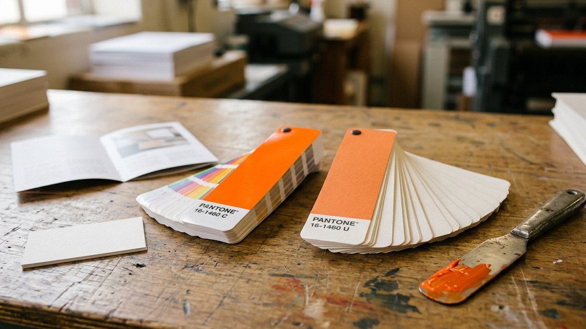
A Pantone number is a recipe for a physical ink, not a colour on a screen. The letter after it tells you which paper the swatch was printed on: C = coated (glossy or silk), U = uncoated (matte, absorbent). The ink is identical; the paper changes how it looks. Coated stock keeps the ink on the surface so the colour stays bright and sharp; uncoated stock soaks it in so the same ink prints softer, lighter and warmer. Send us the suffix that matches your paper — and if your brand guide only lists one, tell us and we will translate.
What a Pantone number actually is
The Pantone Matching System (PMS) is a library of about 2,300 spot colours, each mixed to a published formula from 18 base inks — the print equivalent of a paint chip. Because it is a formula rather than a screen value, a printer in Houston and a printer in Paris can mix PANTONE 186 and land on the same red. That is why designers specify Pantone for logos and brand colours: it is the only way to say 'this exact colour' across different presses, papers and vendors.
It also explains why a Pantone colour cannot be 'printed' by a normal four-colour (CMYK) press. CMYK builds colour from dots of cyan, magenta, yellow and black; a Pantone is a single pre-mixed ink. Many Pantones — bright oranges, deep blues, most greens, every metallic and neon — fall outside what CMYK can reproduce at all.
C vs. U: the paper is the difference
- PANTONE 186 C — the swatch was printed on coated paper. The ink sits on a sealed surface, dries by oxidation, and reflects light evenly: maximum saturation and contrast.
- PANTONE 186 U — the same ink formula printed on uncoated paper. Fibres absorb the ink, light scatters in the paper surface, and the colour reads lighter, less saturated and slightly warmer. Dark colours lose depth; pastels can look washed out.
- There is also an M (matte coated) suffix in older guides, and CP/UP for CMYK-simulated versions in the Color Bridge guide.
- The gap is not small. On a typical red the shift between C and U is visible from across a room; on navy, forest green and burgundy it is dramatic; on a pale grey it can be the difference between 'grey' and 'almost white'.
Why it matters on your job
- You send us '186 C' and order uncoated business cards or a kraft label. We mix 186 exactly — and it comes back looking like 186 U, because that is what 186 looks like on uncoated paper. The ink was right; the reference was for the wrong paper.
- Brand consistency: your gloss brochure (coated), your letterhead (uncoated) and your kraft packaging can each need a different Pantone to *look* the same. Good brand guides list a C and a U value for every colour for exactly this reason.
- Letterpress, kraft labels, Colorplan folders and cotton stocks are all uncoated. If the job is on any of these, the U reference is the one that predicts the result.
- Screens lie. A Pantone shown in Illustrator or on this page is an sRGB approximation of the coated swatch; it is brighter than either version will print. Only a physical swatch book under daylight (D50) tells the truth.
Which reference should I send?
- Gloss or silk cover, coated labels (BOPP, semi-gloss paper), most booklets and brochures → send the C value.
- Uncoated card, letterhead, kraft or felt labels, Colorplan, cotton, letterpress, envelopes → send the U value.
- Don't have a U value? Send the C value and tell us the paper. We will pull the U swatch for the same number and confirm the look on your proof, or suggest a neighbouring number that lands closer to the coated look.
- Metallics (871–877) and neons (801–814) exist as C only and need coated or specially prepared stock; on uncoated paper metallic ink turns flat — that is when we recommend hot foil instead.
- Never send a HEX or RGB value alone for a spot colour. We can convert it to the closest Pantone, but you should approve that choice before press.
When CMYK is fine — and when to insist on spot colour
For full-colour work with photos, we print CMYK and simulate your Pantone with the closest process build (the Color Bridge 'CP' value). For most colours the match is close; for saturated oranges, royal blues, bright greens and anything metallic it is not. If the logo colour is the point of the piece — a business card, a folder, packaging — order it as a true spot colour, or add a fifth spot-colour unit to the CMYK job. We tell you on the quote when a colour is out of the CMYK gamut.
Use the converter before you send the file
Our free Pantone ↔ CMYK ↔ HEX converter shows any colour three ways — as it prints on coated stock, on uncoated stock and on kraft — and lists the closest Pantone references for a brand colour you only have as HEX or CMYK. Type your brand HEX, pick a Pantone, or enter a CMYK build; then send us the reference straight from the result.
How we match colour in Houston
- Ink is mixed to the current Pantone formula guide and checked against the physical swatch under a D50 viewing lamp — not on a monitor.
- Every spot-colour job gets a drawdown on your actual stock before the run; on request we mail the drawdown for approval.
- We report the ΔE (colour difference) if you need documented tolerance for a brand or franchise programme; standard tolerance is ΔE ≤ 2 on coated, ≤ 3 on uncoated.
- Re-orders reference the archived ink batch and stock, so year-two cards match year-one.
- CMYK vs Pantone Spot ColourWhy process colour drifts and spot colour matches
- Letterpress Printing Done RightOne Pantone U colour on duplexed Colorplan
- GF Smith Colorplan Paper Guide55 uncoated colours and how ink behaves on them
Frequently asked questions
- What does the C or U after a Pantone number mean?
- C means the swatch was printed on coated paper, U on uncoated paper. The ink formula is the same; the letter tells you which paper the reference colour was viewed on, and therefore how the colour will look.
- Is Pantone 186 C the same ink as 186 U?
- Yes — the same formula. It looks brighter and more saturated on coated stock (C) and softer, lighter and warmer on uncoated stock (U).
- Which should I send for business cards?
- Coated or silk cards: the C value. Uncoated, cotton, Colorplan or letterpress cards: the U value. If you only have one, send it and tell us the paper.
- Can you print a Pantone with a normal CMYK press?
- Only approximately. CMYK simulates spot colours and misses many oranges, blues, greens, neons and all metallics. For exact brand colour, order a true spot-colour job or add a spot unit.
- Why does my Pantone look different on screen than on the proof?
- Screens show an sRGB approximation of the coated swatch and are usually brighter. Judge colour from a physical swatch or a printed drawdown under daylight, not from a monitor.
- Can you convert my HEX brand colour to a Pantone?
- Yes — use our converter to see the closest Pantone references and how they print on coated, uncoated and kraft, then confirm the choice with us before press.
Kolt Printing ships from Houston, TX every business day.
Live pricing on every product. Free die templates. Same-day shipping cut-off at 11 AM Central. Trade pricing for agencies and print brokers.